Friday 7 October 2016

PRELIM TASK:

Audience feedback

I showed my peers my work and asked then to evaluate it by doing a 'what went well' and an 'even better if'. These are the responses: 


Monday 3 October 2016

PRELIM TASK:

Final Cover and Contents Page Cohesion!
So I've finally finished both pieces of work and I like the outcome of them as I think they look good for a first try. I feel like there is a clear bond between the magazine cover and contents page, mainly because of the choice of colour. I began to play around with the colour purple as the book that my model is holding is a light shade of purple and this became my feature colour. I used the same purple as a background to my masthead and used the same colour as the background to my contents page. I think this works and you could tell that they're from the same magazine. Another bond between the two would be the fonts used. The font used for my masthead is the same font I used for the word 'contents', which are both justified to the left and the name of my magazine is visible on my contents page as well. Moreover, the quote leading on from the magazine cover to the contents page is again, in the same font. This gives it a sense that it's from the same magazine too. I made the decision to do that because it makes the reader want to open the magazine to see what more there is, due to the ellipses giving it that effect. I've used italics on both the cover and the contents page to enhance the way the text looks and make it stand out. Furthermore, my model on my magazine cover is used there as well as the pictures for my contents page which in both, her angle of gaze is towards the reader. I was inspired to do this when i saw it in a 'Vibe' magazine where the model (Ciara) was on both the front cover and contents page. Areas I think I could probably improve on would be my photography, considering mis-en-scene and looking more at real media texts as they actually help a lot! Overall, I'm happy with how they both look and very much think they look better than the previous versions.
Here they are:


PRELIM TASK:
Contents page, flat plan to final!


Saturday 1 October 2016

PRELIM TASK:

My masthead manipulation:


PRELIM TASK:

My Chosen Photos

I chose to use this picture for my front cover as Priyanha (my model) looks quite friendly. I think her pose of a slight smile with a raised eyebrow draws in the reader with her angle of gaze straight towards the audience. Her holding the book shows that it’s a college magazine, with the impression that she’s into studying and likes doing work.
Originally I wanted to do a two shot but my teacher said that it could take up a lot of space on the cover of the magazine so I decided to stick to one person and do a mid-shot (which fits my brief). I wanted to do a two shot because I thought it went with the masthead of the magazine which was originally ‘mafia’ but now ‘alliance’.

I chose to use these photographs for my contents page as I think that they show a bit what school is about, in this case, the balance between studying and students’ social lives. The first picture is a group of three, symbolising friendship between the college students, showing that they enjoy each others’ company – giving off a good vibe.

The second picture of my model Shiwani, is her holding a folder and book looking down. This gives off the effect that school can be stressful at times and can put pressure on a person. Though I think the picture after, balances it out as it’s a two shot, with the models looking contemplative, meaning they know what they’re doing and are serious about studying. This gives them a confident look as their angle of gaze is towards the audience too.


Wednesday 28 September 2016

PRELIM TASK:

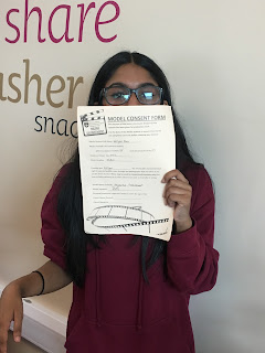
Model consent forms!!

A model consent form is one which both the model and I sign which gives me access to use their pictures.
Here are the models I chose to use:


PRELIM TASK:

Flat Plan

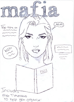
This is the flat plan I drew for my magazine cover and contents page. I intend to make my work look like this and possibly add a couple of changes if things don't go as they should or I find better ideas!

PRELIM TASK:

Shot list

So these are my shot lists for my front cover and contents page. For the front cover shots, I have mainly drawn plans for close ups and medium shots as I want the model to really stand out. However, in the shots for the contents page, I have included more medium and long shots and even a two shot! In my contents page, I plan to use 4 pictures so I'd like to have a range of shot types. In the shot lists, I have included the following:

    . The shot type

    . Location

    . What the model is doing/Any props  used

    . The mis-en-scene


Tuesday 13 September 2016


PRELIM TASK: Magazine deconstruction


Hi! So this is my version of deconstructing a magazine cover. This task is to aid my preliminary task of creating a magazine cover of our own. By doing this task, I learned what needs to be included on the cover of a magazine and how I can make mine look good, and appeal to my target audience too. I've learned a range of new words and meanings and doing this has helped me gain a better understanding of them. I enjoyed doing this task as it helps me with my preliminary and it was part of a magazine I can relate to myself!

Hi and welcome to my blog for media studies! I really think I'll enjoy media as I'm interested in current issues. I'll be showing all my year 12 work on this page so keep visiting for new updates and to see how I get on. :)
So, our current project is a preliminary task. For this we've been briefed to make a magazine cover and contents page for school or college. Seems pretty straightforward but I know that there'll be a lot more work involved. The magazine is required to have a picture of a model from the waist up. Also it should include all the convention of a magazine (you'll see what I mean by conventions in my magazine deconstruction post). We also take our own photographs and learn to use the art of Photoshop. I'm really looking forward to it and can't wait to start!